
Table of Contents
ToggleRepresenting numbers in clear, eye-catching visuals has now become a necessity in our quick, data-driven world. It has become very important and no longer an option. There are various types of Data visualization tools that transform complex datasets into easy-to-understand charts, dashboards, and reports. Since the arrival of these in the market, it has been benefiting Businesses, researchers, and analysts. They have been playing a very important role in uncovering patterns, monitoring performance, and making informed decisions. If you are looking to know this deeper, this guide will help you find the Best Data Visualization Tools. This will share real-world examples, explain how to choose the perfect one, and highlight data cleaning techniques you must know before building dashboards.
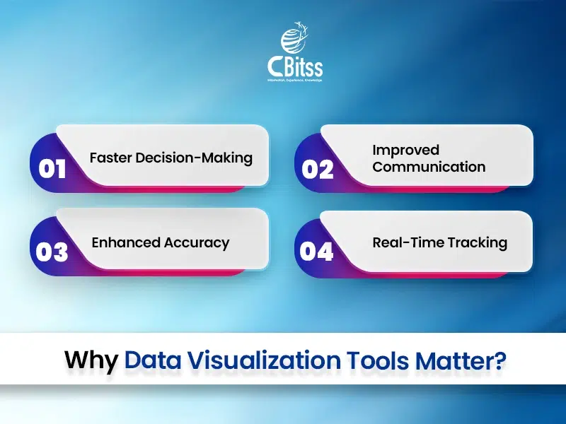
Why Data Visualization Tools Matter
Faster Decision-Making
Clarity is one of the best things that the best data visualization tools can deliver. They convert dense, complex data into visuals that speed up analysis and free up time.
Consequently, this can interpret trends of decision-makers without spending hours on raw data. Also, if these are paired with strong data cleaning techniques in data analytics, the visuals can become more accurate and reliable.
Improved Communication
Another thing that these tools do is improve communication. They allow stakeholders to gather insights instantly because they present information visually, which leads discussions to be more productive and goal-oriented. For example, pairing pandas data cleaning techniques with dashboards ensures clean inputs for clearer messages.
Enhanced Accuracy
Additionally, visual representation minimizes misinterpretation by presenting precise, structured data. Therefore, teams can rely on the output with confidence. Techniques like Cody’s data cleaning techniques using SAS ensure that datasets are refined before visualization.
Real-Time Tracking
Finally, unlike traditional tools, dashboards update instantly, which enables real-time monitoring of performance. Hence, organizations can take action immediately when changes occur.
After all, cleaning regularly and updating data is the foundation to reinforce why cleaning data techniques matter as much as visuals.
Essential Features of a Great Data Visualization Tool
1. Easy to Use
Decide if you will work visually or through code, and then select a tool that feels more appropriate for you.
2. Integration Options
Next, ensure the tool seamlessly connects to your databases, cloud platforms, and APIs. Consequently, this will save time during setup.
3. Customization
Additionally, pick a tool that allows flexible chart types and consistent branding.
4. Collaboration
Furthermore, Easy sharing and real-time teamwork should be the one you will be using
5. Cost
Finally, see the pricing. If it is free, or premium, or if it is enterprise pricing. You can set it according to your budget while ensuring you still have the essential features.
Comparison of Best Data Visualization Tools in 2025
Tool | Ideal For | Pricing | Why It Stands Out |
Tableau | Large enterprises & BI teams | Premium | Provides rich and interactive dashboards with deep analytics and solid database connectivity, which is perfect for complex business insights. |
Power BI | Microsoft ecosystem users | Affordable | Handy with Office 365, Excel, and Azure, making automation easier and smoothening automation and reporting. |
Google Data Studio (Looker Studio) | Digital marketers & analysts | Free | Provides great tracking and comparison of campaign performance, connecting in real time to Google Analytics, Ads, and BigQuery. |
Qlik Sense | Advanced and complex analytics & data models | Premium | Finds unseen trends through an associative data model and delivers AI-powered decision support. |
Zoho Analytics | Small to mid-sized businesses | Affordable | Makes reporting easy with automation, mixes data quickly, and has built-in tools for team collaboration. |
Simplify your data and impress with stunning visuals.
Data Visualization Use Cases
Marketing – Tracking Ad Performance in Google Data Studio
Firstly, to track ad campaigns in real time and to spot which ads generate the most engagement, marketing teams easily use Google Data Studio. As a result, they can quickly compare how each channel is performing. Consequently, this allows them to adjust both targeting and budgets for better profitability.
Finance – Monitoring KPIs and Trends in Power BI
In the same way, financiers rely on Power BI to track KPIs and market trends. Through this, they can track investment opportunities faster. Additionally, they forecast future performance using visual dashboards. Thus, they make more confident financial decisions.
Healthcare – Analyzing Patient Data in Tableau
Similarly, Tableau is used by the healthcare sector to analyze patient treatment outcomes. In fact, they identify recovery times and treatment effectiveness. As a result, patient satisfaction and health outcomes increase with the improvement of care plans
Education – Visualizing Student Performance in Zoho Analytics
Finally, educators can visualize student performance by using Zoho Analytics. By using this, they can track students’ performance. How slow and how fast the students are learning. Then, according to the students’ learning pace, they can design something personalized for the students’ learning strategies.
A-Z Guide: Build Your First Dashboard in Power BI
1. Connect Data
Firstly, to make sure you have accurate integration, you can link your data from Excel, SQL, or cloud sources to Power BI.
2. Select Chart Type
Next, to visualize patterns effectively, choose bar, line, pie, or map charts of your own choice.
3. Add Filters
Then, create slicers and filters for interactive user experiences.
4. Customize Layout
After that, adjust fonts, colors, and sizes so that you can improve readability and design appeal.
5. Publish & Share
Finally, publish your dashboard, provide the link, or place it in professional reports for easy sharing.
Free vs Paid Data Visualization Tools
| Feature | Free Tools (Google Data Studio) | Paid Tools (Tableau, Power BI Premium) |
| Cost | $0 | $10–$70/user/month |
| Data Sources | Limited integrations | Extensive integrations |
| Customization | Basic templates | Advanced customization |
| Scalability | Limited | Enterprise-ready |
Trends in Data Visualization for 2025
1. AI-Assisted Dashboards
Keeping this in mind, use AI-driven dashboards to reshape analytics. It can provide instant insights and make decisions faster.
2. Augmented Analytics
Additionally, use visuals in predictive modeling for generating more accurate results and expanding foresight.
3. Mobile-First Dashboards
Likewise, design the tool with a mobile-first approach to help executives make timely decisions and increase agility.
4. Interactive Storytelling
Above all, to boost audience engagement and understanding, you can combine your narrative with clickable charts turn data. This will even make it into interactive stories.
Compare features to choose your perfect data tool.
Common Mistakes to Avoid
1. Excess Visuals in a Dashboard
To begin with, the dashboard must not be crowded with a host of graphs or widgets. To this end, ensure that you purposefully purpose your visual. As a matter of fact, excessive use of visual displays can result in making the information undigestible. That is why you, pay attention only to the relevant KPIs. Simple things always make the world go round.
2. Selecting Misleading Charts
Choosing misleading Charts is the act of selecting Charts that distort the information they display. In this regard, align the chart type with your data type. E.g., do not use pie charts when you need to compare exactly. Similarly, a line chart should not be used in the presentation of categories but rather on trends. This means that insight may be distorted due to poor chart selection.
3. No Caring about Mobile Responsiveness
Nowadays, a significant part of the users access dashboards on mobile. Thus, make your design responsive to the screen. Likewise, navigate the tests and readability on other devices. Failure to Change Datasets regularly. In fact, outdated information decreases the accuracy of decisions. So, write an automated schedule data refresh. Finally, dynamism ensures credibility in the provision of timely updates.
Best Practices of Data Visualization
1. Provide a Clear Question to Start With
The first one is to identify the purpose with no apleading. Consequently, your charts will be in line with decisions.
2. Consistent Color Coding Should be Utilized
Besides, use the same shades on similar categories. Likewise, it is also unwise to have too much of a shift in palette.
3. Limit Chart Variety / Dashboard
Anyway, an excessive variety of charts confuses the audience. Thus, to stick to consistency, use 2-3 types.
4. Labels and Captions to Give Context
As a matter of fact, context avoids misinterpretation. Therefore, never leave out the descriptive captions.
How to Choose the Right Tool?
1. Put Your Objectives
The answer to the first question is the following: is it business or marketing, or research? Tool selection is accelerated by clarity in purpose.
2.Data Sources Checks
Moreover, make sure that it is cloud-compatible or on-premises. In the same way, have secure integrations.
3. Prod Team and Skills
That is, do not make the match tools too complex, especially when it comes to promoting the expertise of your team. Similarly, choose no-code tools in case the coding abilities are not high.
4. Scale Planning
Thus, select the tools that can evolve along with you. Ultimately, this is cost-effective and easy on migration.
Related Resources
- Short-term computer courses – Enhance your skills in weeks.
- More about analytics – Learn practical business applications.
- Trends in data science – Stay ahead in the analytics field.
- Data science certifications – Get recognized credentials.
- Data Analyst Institute – Find the best training centers.

Conclusion
Remember, as we conclude, Data visualization tools are not only for design, but their value is known for their ability to give accurate insights to decision makers whenever they need them. So, data cleaning techniques are often paired with these tools to make sure that every visual is backed by reliable information.
Whether you’re applying pandas data cleaning techniques as an analyst or Cody’s data cleaning techniques using SAS methods in enterprise environments, remember that the quality of your data drives the quality of your visuals.
To reduce errors, enhance clarity, and build stakeholder trust, apply effective cleaning data techniques before visualization.
The right combination of visualization software and data cleaning techniques in data analytics is a must to transform the way you interpret and present information, no matter of field you are in, whether you are in marketing, finance, healthcare, or education. So, to make sure that your dashboard remains relevant, insightful, and impactful in the present day, invest in the right tool, adopt best practices, and avoid common mistakes.

Sukhamrit Kaur
Sukhamrit Kaur is an SEO Manager. She combines creativity with strategic SEO expertise to simplify complex ideas and drive online visibility. Passionate about digital growth, she helps businesses achieve measurable results through data-driven strategies, impactful content, and optimized search performance.